
A new visitor decides almost instantly whether your website is worth their time. If they cannot tell what you do, who it is for, and what to do next, they leave, and they rarely come back. The good news is that you can test this yourself today, in five minutes, with one person who has never seen your site. Here is how to run the test, the ten things a homepage needs to pass it, and the mistakes that make most business websites fail.
The five-second test
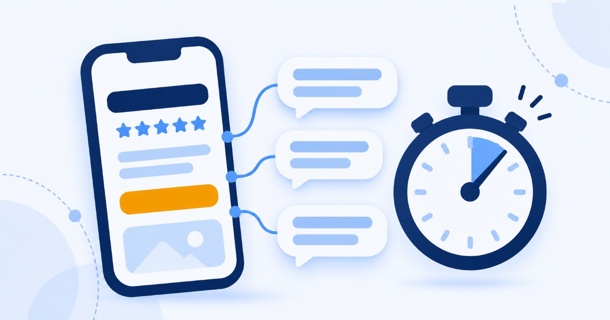
This is a classic usability exercise, and it is brutally honest. Here is how to run it.
- Find someone who has never seen your website. A friend, a relative, a neighbour. Not a colleague, they already know too much.
- Show them your homepage on a phone for five seconds, then take it away.
- Ask three questions: What does this business do? Who is it for? What would you click next?
If they answer all three correctly and confidently, your homepage works. If they hesitate, guess, or get one wrong, you have found exactly why visitors are leaving. Repeat with two or three more people for a clearer picture.
The 10 things a homepage needs to pass
1. A headline that says what you do, in plain words
Your main headline should describe what you offer, not how you feel about it. "Excellence in every detail" could be a bakery or a law firm. "Wedding cakes baked to order in Bristol" cannot be misunderstood.
2. Who it is for
Name your customer, either in the headline or right below it. People stay when they recognise themselves.
3. One clear next step
Choose the single most important action, book, call, buy, or get a quote, and make it the most visible button on the page. Five equal buttons is the same as none.
4. Proof, near the top
A short line of real reviews, a genuine number such as years in business or customers served, or a recognisable client. Only use proof that is true. Invented badges and fake reviews destroy trust the moment someone checks.
5. It works on a phone first
Most visitors will see your site on a phone. Check that the headline, the proof, and the button are all visible without scrolling, and that the button is easy to tap with a thumb.
6. It loads fast
A slow homepage loses people before the test even starts. Heavy images, autoplay videos, and too many scripts are the usual culprits. Speed is part of the foundation we described in why technical SEO comes first.
7. Where you are and how to reach you
If location matters to your business, show it. Make your phone number, email, or contact link easy to find. Hidden contact details make a business feel less real.
8. A hint about price
You do not need a full price list on the homepage, but a starting price or a price range removes the biggest reason people hesitate. "From £49" invites a click. Silence invites a back button.
9. Real photos
Your team, your space, your work. Generic stock images of smiling strangers say nothing about you. Real photos, even simple ones, build more trust than polished fakes.
10. Something for people who are not ready yet
Most visitors will not buy on their first visit. Offer a gentle second option, a free guide, a checklist, or a newsletter, so they leave with a reason to come back.
Before and after: headlines that pass
The fastest improvement on most homepages is rewriting the headline. Here is what that looks like.
| Fails the test | Passes the test |
|---|---|
| Welcome to our website | Same-day boiler repairs across Manchester |
| Innovative solutions for tomorrow | Bookkeeping for freelancers, done in one hour a month |
| Your trusted partner in success | Employment lawyers for small UK businesses |
| Passion. Quality. Excellence. | Handmade leather bags, built to last 20 years |
| Transforming the way you live | Interior design for small apartments, from £500 |
Notice the pattern. Every winning headline answers what, for whom, and often where or how much. None of them needs a single adjective to work.
Why this matters for search and AI too
People are not the only ones taking the five-second test. Search engines and AI assistants read your homepage to work out what your business is. A vague headline that confuses a stranger confuses them too, and an AI tool that cannot tell what you do will not recommend you when someone asks. Clear, specific wording is one of the simplest ways to be understood, a theme we explored in getting your brand cited by AI.
It also explains a frustrating problem many businesses have: visitors arrive, but nothing happens. If that sounds familiar, our guide on traffic but no leads goes deeper.
The mistakes that make homepages fail
- Rotating sliders. Most visitors only ever see the first slide, and the movement distracts from your message. Pick your strongest message and show it once.
- Jargon and slogans. Words like "solutions", "synergy", and "next-level" sound impressive and mean nothing to a stranger.
- Too many choices. A menu with fifteen items and a homepage with eight buttons leaves visitors unsure where to go.
- Talking only about yourself. "We were founded in…" can wait. Lead with what the visitor gets.
- Autoplay sound or video. Nothing makes people close a tab faster.
- Hiding the proof. Great reviews buried at the bottom of the page do almost nothing. Move them up. If you need more of them, our 30 review request messages help.
Planning a full redesign?
Most homepages do not need one. Rewriting the headline, moving proof to the top, and clarifying one button often fixes more than a new design ever would. If you do decide to rebuild, protect the visibility you already have, which our guide to a website redesign without losing rankings covers step by step.
Frequently asked questions
What is a five-second test?
It is a simple usability test. You show someone your homepage for five seconds, then ask what the business does, who it is for, and what they would do next. If they cannot answer clearly, your homepage is not communicating fast enough.
What should be on a business homepage?
A plain headline that says what you do, who it is for, one clear call to action, real proof such as reviews, contact details, a hint about price, real photos, and an option for visitors who are not ready to buy yet. All of it should work on a phone.
Why are people leaving my website so quickly?
Usually because they cannot tell, within a few seconds, whether you can help them. Vague headlines, slow loading, and too many choices are the most common causes. Run the five-second test to find out which applies to you.
How long should a homepage be?
Long enough to answer a new visitor's main questions, and no longer. The top of the page does most of the work. Everything below it should support the main message, not compete with it.
The bottom line
Your homepage has a few seconds to answer three questions: what you do, who it is for, and what to do next. Run the test today with someone who has never seen your site. Their confusion is free consulting, and fixing it is often the cheapest growth you will ever find.
Want a second opinion beyond your friends and family? Our free SEO and AEO audit shows how your website reads to search engines and AI assistants, and the specific fixes that would help more visitors find you and stay.